
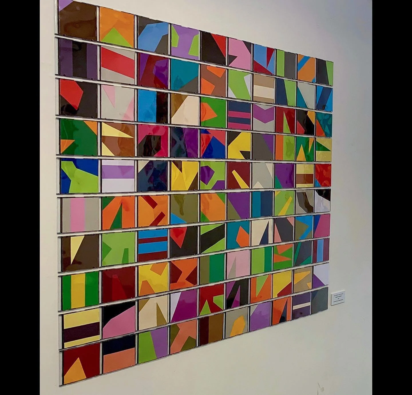
A Journey through Shape and Colour Creations.
As a founding member of Crate59 Art Gallery since its inception in Cairns in 2009, I have been exhibiting regularly in many group and solo shows throughout the last 14 years. My artwork continues to look at the relationships between shape and colour, and how the two interplay to form simple or sometimes complex patterns. I use colour to suggest depth and dimensionality, and the healing effects it can have to the viewer.
Each colour has it’s own energy when placed beside another, and different emotions and effects can be achieved through different compositions. The repetitive use of forms can be seen as a quiet meditation on order in what can sometimes be a chaotic world. Every shape and colour, while distinct, contributes to the overall harmony of every piece or installation, suggesting themes of unity, optimism and energy.
My continuing Arts Practice is an exploration of the interconnectedness of all things, interlocking shapes and colours that symbolise the complex web of relationships that frame our lives.
EXHIBITIONS: 2009 - 2024
-
![]()
CHROMATHERAPY
2024
-
![TOPOGRAPHY]()
TOPOGRAPHY
2024
-
![MATHEMATICAL MEMORIES]()
MATHEMATICAL MEMORIES
2023
-
![CHROMATIC INTERPLAY]()
CHROMATIC INTERPLAY
2023
-
![SPOT COLOUR STUDIES]()
SPOT COLOUR STUDIES
2022
-
![EVOLVE]()
EVOLVE
2021
-
![FLIGHT]()
FLIGHT
2015
-
![JOURNEYS]()
JOURNEYS
2023
-
![INFINITY]()
INFINITY STUDIES
2021
-
![SUMMER]()
THE SOUNDS OF SUMMER
2014
-
![CALM]()
CALM
2013
-
![construction]()
CONSTRUCTION
2010
-
![]()
COMPACT COLOURS
2019
-
![]()
JOURNEY'S END
2015
-
![]()
ERROR 404
2016
-
![]()
SPARK
2011
-
![]()
CONSTRUCT
2012
-
![]()
STRENGTH
2013
-
![]()
CONNECTIONS
2021
-
![]()
INFINITY SERIES 1
2021
-
![]()
INFINITY SERIES 2
2021
-
![]()
INFINITY SERIES 3
2021
-
![]()
SUNSETS
2022


Explore - (click on images for more detail)
CHROMATHERAPY
(2024)
Latest works featuring an exhibition of Artworks, Installations and Interactive Art
(More images coming soon)
Open 19th July - 17 August 2024
Crate59 Gallery, 59 Sheridan Street, Cairns.

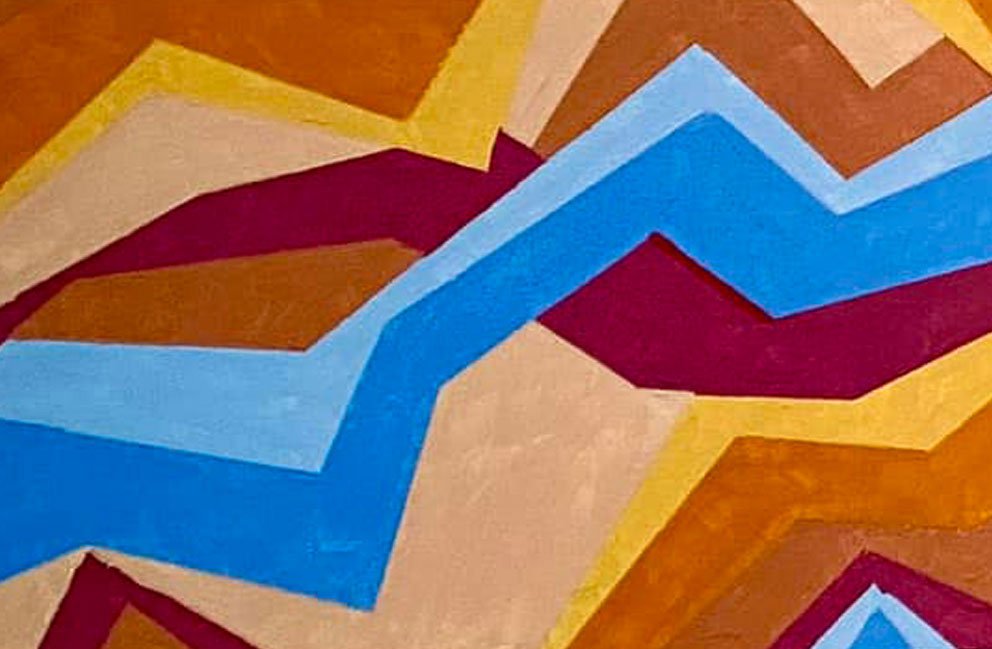
TOPOGRAPHY
(2024)
60cm X 40cm - Acrylic on Canvas
These works continue to explore the theme of ‘Journeys’ as an imagined from above, following the watre’s edge to places unknown.
MATHEMATICAL MEMORIES
(2023)
Cuisenaire Rods on Board for the Crate59 gallery Group Show ‘SUBTRACTION’.
The use of these classic learning tools evokes a sense of nostalgia and familiarity, taking on a new significance and dimension with their arrangement in a harmonious and mathematical composition.
In responding to the group show’s theme, I aimed to highlight the interconnectedness of Art and Math, and to appreciate the aesthetic qualities of the subtracting shapes.

INFINITY STUDIES
(2021)
Acrylic on Board (30 x 40 cm)
These were the first explorations in my geometric ‘Infinity’ series working from a strict rule of 5cm x 5 cm grid design where no one colour is the same next to itself.
Lessons learned though, painting with cheap acrylic paint onto wooden board as every time I peeled the tape up after drying, it would mostly lift off parts of the colour !!!! So frustrating and I would redo whole sections again and again (hence the title). These two small works took forever to complete and you can still see masking errors if you look closely.
Subsequent works after these two , were painted on canvases with better quality paint and tape.
Overall though , it is about achieving an aesthetically appealing geometric design through the use of colour.
THE SOUNDS OF SUMMER
(2014)
Acrylic on Canvas (50cm x 50cm each).
These older works of mine really touch on my fascination with the use of colour to denote a mood, a time and a place. Theses two canvases are entirely abstract and simple in their geometric patterns, but the feeling of being happy at the beach on a summer holiday is unmistakable. These works shine with happiness and joy, purely with colour.

JOURNEY’S END
(2015)
Watercolour on paper (42 cm x 60 cm).
Water colours can be so pure and honest and expressive of everything I want. I love working in this media when I can. This work shows a ‘journey of Colour’, ever hoping to reach that final goal of hope … but sometimes the ‘journey’s end’ isn’t where I had expected to be.
There is a certain ‘game board’ feel to this artwork, and that was the intention … one wrong move and there is no-where else to go. The colour tones were specifically chosen to be calming, when the journey itself can be so risky

CONSTRUCTION
(2010)
Metal Buttons on Perspex. (60cm x 60cm).
I made this harder for myself than it needed to be at the time. I bought a professional Badge/Button Maker and made each coloured metal button from the ‘Badge Press’, I controlled the exact colours I needed for placement on the clear plastic Perspex.
It may have been easier just to buy the coloured dots, but the end result of the 3D effect of the rounded button badges gave a fantastic unexpected shadow play that created interesting lighting effects.

COMPACT COLOURS
(2019)
Cd Insert Cases and coloured card. (100cm x 100cm).
This installation was in collaboration with Kerri Crawford. Inspiration was found by working with familiar materials such as CD cases and transforming them with blocks of Colour arrangements.
The varying effects and changes that could be made with changing and shaping the colour card inserts was really enjoyable.
This was a creation that evolved as it was built, activating the space with bursts of colour.

CALM
(2013)
Acrylic on canvas (50cm x 50cm).
Each painting evokes its own type of calm within its own simplicity. Using a basic colour palette of Primaries plus green, the placement seems quite random, but it is not. Each colour in each artwork, appears only once in a horizontal row and vertical column. The balance automatically happens of its own accord and the harmonious sense of calm comes through.
It’s like a giant canvas painted sudoku, but with colour. When the two artworks are displayed together, the objective of complete balance is achieved.
These appear to be simple works, but proof that the journey of Colour can be very calming when planned correctly.
JOURNEYS
(2023)
Acrylic on canvas
300cm x 100cm - triptych
“The three ‘Journeys’ paintings present an exploration of life’s pathways, choices and challenges. Through the symbolism of colourful lines and obstructing blocks, viewers are invited to reflect on their own personal journeys, considering the decisions they’ve made, and the strength in overcoming personal obstacles. These paintings are a reminder that our own journeys are complex and multifaceted, each one telling a story of resilience and growth. “

SPOT COLOUR STUDIES
(2022)
Hand Cut Card on Acrylic board. (30 x 40cm each).
These colour studies were trying to develop an interrelationship between colours in their corresponding spectrums and using shape and line to force the eye to continually travel around the works.
These studies were made purely for the enjoyment of playing with colour and when they were exhibited, looked fantastic on the gallery walls.

EVOLVE
(2021)
Acrylic on Wood (30cm x 100cm each).
Working with a variation on my ‘Flight’ installation, using the same dimensional template, I worked with the smaller shapes to see the colours evolve and spread for a different effect.
This triptych featured in a group exhibition last year and the colours shine through the front window display.

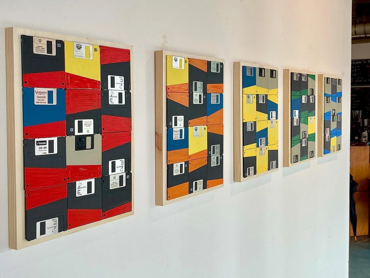
ERROR 404
(2016)
Mixed Media and Acrylic on board (30 cm x 40 cm each).
Working with recycled materials to repurpose, brings these pieces to life. These old Computer discs were fascinating to me in their own ‘geometric’ lines and shapes .. I added colour to their already interesting forms for display.
‘Destination not Found’ tells a story that not all expectations of where we thought we were heading, hold true. That’s life though, and we do our best to move on, and try to do better.

FLIGHT
(2015)
Acrylic and wood installation. (5 meters x 2 meters approx).
This older work of mine of hand cut, hand painted triangular shapes created a visual movement of Colour that seemed to take flight. The planning for this installation first involved getting the exact dimensions correct for the triangle template as I needed to be able to create a perfect ‘octagon’ with the shapes combined.
Then it was a process of choosing the two colour combinations that each piece would have, and how they interacted with each piece next to it. After constructing the three ‘base’ octagons, it was then a matter of the design generating outward and combining together.
The negative space created was just as important here as the eye tends to ‘connect the shapes’ and the wall installation seems to complete itself and subconsciously expand all on its own.
I really like this work as it took a long time to plan, make, paint and install, but the effect was worth it overall.

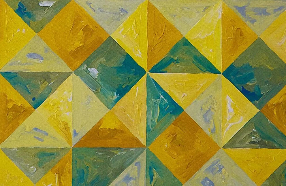
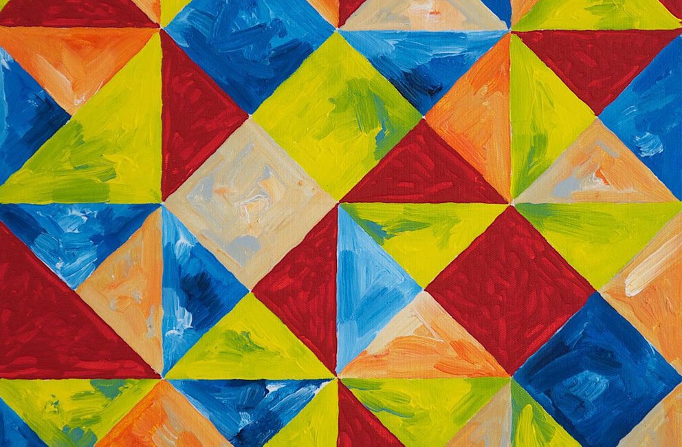
CHROMATIC INTERPLAY
(2023)
Cadmium Yellow Gouache on Card and Board 1200cm x 1200cm
"Chromatic Interplay" is an artwork that explores the relationships between colours and how they can shape our emotions and perceptions.
This artwork demonstrates how colours can impact our senses and influence the way we feel. By placing different colours next to each other, a sense of contrast, harmony, or tension is created that can evoke a wide range of feelings and associations.
Yellow, in particular, is a colour that is often associated with warmth, joy, and optimism. By using this colour as the primary element in the current Crate59 gallery exhibition ‘YELLOW’, a sense of positivity and vibrancy is created for this work.
Through this, viewers are encouraged to consider the power of colour and the ways in which it can affect our moods and emotions. By being mindful of the impact that colours can have on our perceptions and experiences, we can develop a deeper appreciation for the role that colour plays in shaping our world.
Overall, this work is a celebration of colour and its ability to influence our lives in profound and meaningful ways.

SPARK
(2011)
Gouche on watercolour paper framed (32 x 45 cm each)
Painting bright bold colours on the paper, I let the image evolve itself, with no real plan of what the final composition would look like …. It all started with a small action of painting a colour triangle, and then each corner built from there.
I really love the vibrancy and energy these two pieces bring , as even though they are only small works, they seem to spark and energize my room.
Maybe it’s time that we all need to find that spark we need to energize life … and it only needs one small brave action to start , with no real plan , but let our world create and evolve as it’s meant to.
CONSTRUCT
(2012)
Acrylic on canvas (50cm x 50cm each)
These two works were exploring the deconstruction and reconstruction of colour, colour relationships, and the notion of control and determination versus loss of control and spontaneity. It is a constant struggle both in art and in life.
Once again, each canvas had its own rules as no one colour is repeated in its own horizontal or vertical row. This achieves a subconscious harmonious balance that nobody ever sees, but happens anyway.
I limited my colour palette to simple warm tones to enhance the feeling of calm and warmth when the works are viewed together.

STRENGTH
(2013)
Mixed media on board (50 x 50cm)
I had so much fun with this piece playing with the simplified colour scheme and the symmetry involved with the overall composition. This piece is made up of four quadrants. Each quadrant is EXACTLY the same, only rotated 90 degrees to the right and colours changed.
There are four rotations and versions of every shape and four colours to each same shape. So even though the artwork seems randomly abstract , it is intricately balanced in every way possible.
I aspire for this kind of balance in my own life as I battle common ‘Aussie’ male stereotypes. My strength comes from being giving and kind to those around me , and it’s often seen as a weakness, but that perception needs to change.
Strength comes from within, being sure about who we are , following heart and mind to try to be a little better each day. True colours then shine through.

CONNECTIONS
(2017)
Acrylic on Canvas (20 x 20cm each).)
Choosing a specific colour scheme and marking out five centimeters around each edge of all canvases , I let the colours choose where they wanted to go and how they interacted.
These connections artworks were specifically about me reaching out to the people and family that I trusted most. I had faith that what was meant to be, is meant to be, in who we connect with and how our journeys continue.

INFINITY SERIES 3
(2021)
Acrylic on Canvas (100cm x 100cm)
This third ‘infinity series’ piece was painted as a commissioned piece . The stages can be seen here as colours would be painted and repainted over and over until the final hue claimed it’s space.
These infinity works were painted during a time of emotional uncertainty, and they served as a form of ‘art therapy’ for my overthinking mind. To quietly paint a few squares or circles gave me calm and much needed solitude. This large artwork is now hanging in a medical practice in Melbourne, and I hope it continues to bring solitude to those that see it.

INFINITY SERIES 2
(2021)
Acrylic on Board (100cm x 100cm)
This second ‘infinity series’ piece took about two months to complete. Gridding the frame meticulously with a five by five centimeter composition, I let colours play against themselves within the geometry space. Introducing a dark colour tone into the mix this time, gave surprising effects. Colours would be painted and repainted over and over until the final hue claimed it’s space.
These infinity works were painted during a time of emotional uncertainty, and they served as a form of ‘art therapy’ for my overactive overthinking mind. To quietly paint a few squares or circles gave me calm and much needed solitude. This is my favorite of the ‘infinity series’ as I’ve allowed the ‘darkness’ to actually BE in my work, and it makes the artwork more interesting to me.
INFINITY SERIES 1
(2021)
Acrylic on Board (100cm x 100cm
Working on the largest scale I’ve done, and the first of my Infinity series, this piece took about three months to complete. Gridding the frame meticulously with a five by five centimeter composition, I let colours play against themselves within the geometry space. Sometimes colours would be painted and repainted over and over until the final hue claimed it’s space.
These infinity works were painted during a time of emotional uncertainty, and they served as a form of ‘art therapy’ during Covid, for my overactive overthinking mind. To quietly paint a few squares or circles gave me calm and much needed solitude, and I believe that the final piece exudes that peace and tranquillity also.
This piece became the central display for my 2021 exhibition ‘The Geometry of Colour’
SELF PORTRAIT 1
(2015)
Mixed Media on board (50cm x 50cm)
This self-portrait is an exploration of my identity through the medium of collage. Created by meticulously cutting and arranging tiny coloured cardboard shapes, I have constructed a vibrant and dynamic representation. Each shape, with its unique hue and form, contributes to the larger mosaic, symbolising the multifaceted nature of personal identity.

SELF PORTRAIT 2
(2017)
Acrylic on Perspex (120 x 180cm)
My initial idea for this self portrait exhibition was to grid up some distorted mirrors, and hang them on the wall, ...as a social comment on how some 'selfies' on social media distort the truth of how we are, and who we are.... but I decided to actually push myself a bit more and paint a portrait - a huge portrait, on transparent perspex panels. I stripped away all colour, and let the painting just exist without distractions.

SUNSETS
(2022)
Mixed Media on Board (30 x 40 cm each).)
Sourcing the intense colours of the found material Washi tape, each strip is continuously layered to produce a colour tone effect inspired by the setting sun over an ocean of blue. The final composition is covered with a layer of clear resin to bind the materials and produce a gloss finish.
These recent works were produced with a sense of ‘closure’ in mind, progressively moving ever onward with a journey into the unknown … but as always, … the sun will rise for another day, and with it brings new hope, new beginnings and new colour.
CHARITY
(2015)
Acrylic on canvas (80 x 60 cm).
There is something therapeutic in how colour sits and reacts against another colour. This is what this painting sets out to explore. Charity can sometimes mean more than donating financial help. To be of service to others can simply mean being able to listen , to be honest and truthful , and to find a way each day to help another, even in small ways. This painting strives to find that calm we seek in amongst the turmoil. The colours are chosen to brighten, and be ‘of service’ to those who need to find their balance again. Charity can start with just one simple shape and colour.

HOPE
(2015)
Acrylic on Canvas (50 x 50cm each) .
This artwork was created at a time in my life where I wanted to maintain the control and order I had developed, but also yearning to break out of the boundaries imposed by my own insecurities. Each colour is pushing and pulling, trying to free from their restrictions. The overall effect is similar to my own sense of self, calming control within the structure I create around me , but also incredibly dynamic within when looking beneath the surface. There is always hope..
NEW BEGINNINGS
(2015)
Acrylic on Canvas (91cm x 61cm).
There are times when a fresh start is the best approach , time to recalibrate and move forward … it may just start with a simple line, a simple single direction, but colour and form soon follows, and something lovely will hopefully be created.
SHATTERED
(2021)
Acrylic on canvas (40 x 50cm each)
A very good friend recently told me that although I don’t post many ‘personal’ photos, I let people see me through my art. In these paintings, I am admitting that sometimes the order and control that we daily strive for can be simply shattered through no fault of our own. This is a natural part of the balance of life, and it’s ok to be ‘not ok’. No matter the situation though, hope and colour in our world will always shine through. It gets better. We can only try to ‘be’ better.

KNOWLEDGE
(2021)
Acrylic on canvas (40 x 50cm each)
These vibrant pieces, rich with interwoven colours and dynamic shapes, symbolise the journey of life and the continuous quest for understanding. As we navigate the myriad twists and turns that life presents, much like the intricate patterns and bold hues in these canvases, we gather invaluable insights from our experiences. Each curve and intersection represents a moment of learning, a point of reflection that adds depth to our understanding of the world around us.

WISDOM
(2021)
Acrylic on canvas (40 x 50cm each)
These two pieces, teeming with a lively array of colours and flowing shapes, capture the essence of wisdom through the lens of life's continuous journey. Each line and curve weaves together to form a tapestry that speaks to the depth of understanding gained through experience. The vibrant colours represent the multitude of emotions and lessons encountered along the way, each contributing to a richer, more nuanced perspective.

TESSELATIONS
(2021)
Acrylic on canvas (40 x 50cm each)
Exploring movement and mood through colour hues, I’ve tried to evoke the feeling of looking through a tropical rainforest canopy where patches of sky always shine through, no matter how much darkness is around us … there will always be room for growth.
Inspired by the rainforest canopies of the Daintree Rainforest, this artwork tries to capture those moments where small patches of sky shine through the maze of nature.

PEACE
(2024)
‘Imagine all the people, living life in peace…’
100cm X 100cm - Acrylic on Canvas
This artwork captures the essence of tranquility and harmony through its intricate mosaic of colours and shapes. The meticulously arranged geometric forms create a sense of calm and balance, inviting viewers to find stillness and serenity within the complexity of it’s forms.

OPTIMISM
(2024)
‘It’s getting better all the time’
“Optimism" mirrors the themes of inner peace, resilience, and renewal, inviting viewers to look beyond the present moment and envision a future filled with possibilities. The dynamic patterns and bold colours serve as a visual metaphor for the potential within each of us to overcome obstacles and create positive change.

Connect
Connect with me if you would like to enquire about any artworks, or just to chat about how colour can be activated to heal, calm and make your own personalised environments a place of peace.